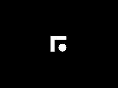
New logo for my website.
Sitting at home in these quarantine times mean that I will have enough time to sit and design my website's identity from scratch. Here is the new logo after like a days worth of iterations. The two intersecting lines represent "R", an repeating alphabet in my personal logos. The circle, more of a full—stop, balances it out.
Having abstract shapes, like these help the branding projects so much since the number of things that can achieved by scaling /shrinking / rotating / repeating these elements.
More by Raghu Nayyar View profile
Like
