Path to Pandemic Data Visualization
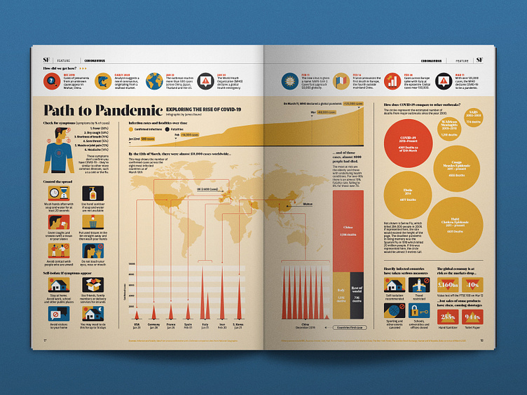
BBC Science Focus approached me to produce an infographic that explored various aspects of the coronavirus outbreak - including an overview, symptoms and a comparission to other outbreaks. Two days later, the World Health Organization declared a global pandemic, and so I decided to shift the focus of the infographic slightly and focus on the growth of the outbreak to that point.
Despite the nature of the subject matter, this was a really enjoyable project to work on; it allowed me to move past the headlines and develop a bit of a deeper understanding of the crisis. In times like this where there's almost too much information to process, inforgraphics and data visualizations can be a powerful tool in helping to give clarity to complexity, as I hope this one does.
