Error 404 Page
How I imagined it first...
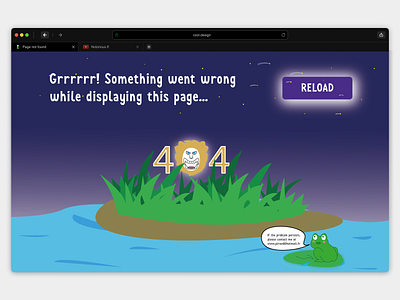
I wanted to make something fun, something with a cartoonish style that could be used for a gaming website for example. So I personalised the 0 of the 404 style text by adding an animal face which represents a danger. So I chose to draw a lion's head with an agressive cartoonish face!
For the text content, I wrote a nice message for the user (remember that it could be a gaming website) to read, and added to this I chose this font : "Joy For Fun". The text is followed by a CTA button in order for the user to notice it directly and to not lose time!
Now let's add the general mood!
I wanted something related with jungle and sea so I first drew my sea, then added the island and the grass (with the lion slightly hidden behind it).
At the beginning I wanted to put a blue sky, but I decided to change for the "purple" one in order to create a contrast with the second part of the design.
Purpose of the design
The contrast created between the "purple" colour and the blue one was designed to separate two sections as I said before.
So first the user will see the error message, and then he just has to click on the button to reload the page.
Second, if the error is still appearing, the user will scan the design in a more detailed way and will, therefore, read the small message in the bubble of the little cuty frog that indicate what to do if the error still occurs :)
