Every • Landing page
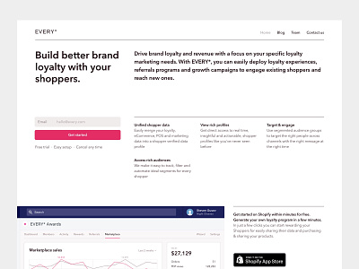
For this landing I tried to go with high density Swiss style approach in order to keep it short yet very informative. From the very first screen customers can read and learn a lot about what Every Awards app is about. The rest of the page keeps same grid system while spicing it a bit with an uneven indentation.
Check out second screen (or attachment, if you prefer so) for the full page view. Mobile version is attached as well.
More by Steven Gusev View profile
Like

