i4C Logo & Brand Design

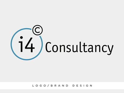
A quick, clean and effective design for a consultancy agency. i4c or "I foresee".
The © symbol/c in the top right is slowly entering the main circle of the logo, having their c-ing part come closer to them in the imagined extension of the 4, as they foresee the possibilities.
Kept the rest very clean and straight to the point, used blue as a color of trust.