TJV Logo & Brand Design

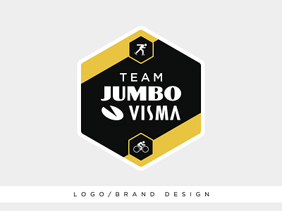
Logo for the Professional Dutch cycling and skating team Team Jumbo-Visma.
The customer wanted a simple design that looked and felt like it could be a part of a sticker. With that in mind I puzzled around and designed this shape to accent it with the white outline.
The shape represents their flexibility, to be able to preform in every direction, other than an arrow or dynamic shape leaning right. They also have a strong attachment to team work. This shape can be stacked with itself to create a honey-comb, which is a very tight, close and strong bond. Their team colors and this concept fit the concept already.