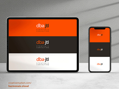
2019-International remote project. DBAJTL Brand Identity.
2019-International remote project. DBAJTL Consulting. Chicago, IL "Powerful growth strategies and effective execution for innovators". Logo development. Creative concept presentation, both design, and writing.
A little bit about DBAJTL Consulting:
"Growth strategy, well executed.
An encyclopedia of amazing strategies is a beautiful thing. The problem is, who has the time, the resources, and the budget to execute them? Honest answer: Nobody.
At DBAJTL, we’re about growth. We’re about zeroing in on the initiatives that will drive revenue. And that can actually be executed - in the real world, on a real schedule, within a real budget. So you can move forward with a plan, and a clear picture of what you’ll achieve.
That’s our approach. That means one growth strategy. The right strategy. Executed well.
The result? Results."
My main idea was to show a balance between strategy and action and also communicate " growth", a strong concept for the business world.
The brand should be clean, objective, stable, modern, serious.
Non-serif fonts plus powerful, elegant colors were some of my thoughts throughout the creative process.
Dominant colors:
Pantone Orange 021
An assertive and energetic color,
yet more balanced than red.
It means:
Action.Innovation.Success.Determination.
Pantone Black C
An elegant, distinctive and sophisticated black.
It means:
Authority.Trust.Power.Confidence.
Accent Colors:
Pantone Cool Gray 1C 50%
Pantone 425C
Both mean:
Experience.Maturity.Professionalism.Stability.
Pantone 319C
It means:
Growth.Abundance.Prosperity.Money.
