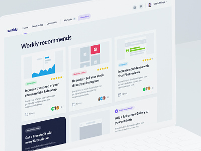
Workly - Dashboard - Home V2
Hi all,
Sharing a V2 of the Workly home screen. In this iteration, we tried a different navigation structure and task card layout (with custom-designed images).
Workly is a fake name for a real project that went sour. I guess that still happens to this day.
Workly is a subscription-based Shopify task management tool that offers on-demand, pre-set or custom tasks. Basically they help you easily manage your Shopify store.
We started the project in late 2019. Through the process, we conducted preliminary UX research including Competitive benchmarking, User flows, Navigation restructures, and Information architecture review on task cards, task management, and catalog.
In addition to our UX research, we conducted a complete UI design overhaul creating a scalable design system with a revised color scheme, typography, grid system, and general style.
Even though the project didn't end positively, It was my feeling that the final result was Dribbble worthy so that's why I'm sharing these dashboard screens.
Thanks to Matt (UX), Wes (UI), and Goutham (UI), for their help on the project.
All the best,
Filip

