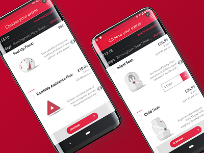
Avis Extras Icons
I was lucky enough to spend 5 years working at Avis Budget Group EMEA in varying digital design roles. It's where I started my UX design career in particular.
Much of that work was under NDA, or has long since been evolved as part of continuous UI/UX optimisation, but one piece of work I'm glad is still in use today is these icons!
At Avis we often found that representing our various ancillary products (products like GPS devices, child seats, etc.) in a consistent way across the globe was a challenge; many products would differ slightly in different markets, so photography that was accurate for one country may not be so accurate in another country.
To avoid issues where customers could end up feeling misled, and to generally improve visual consistency and simplicity across our markets, I proposed that we moved to an iconographic style rather than photography, which could represent all of our various products without the need for product specific accuracy.
I'm happy to see that these icons are still in use on Avis EMEA websites, and I hope they continue to help consumer confidence.


