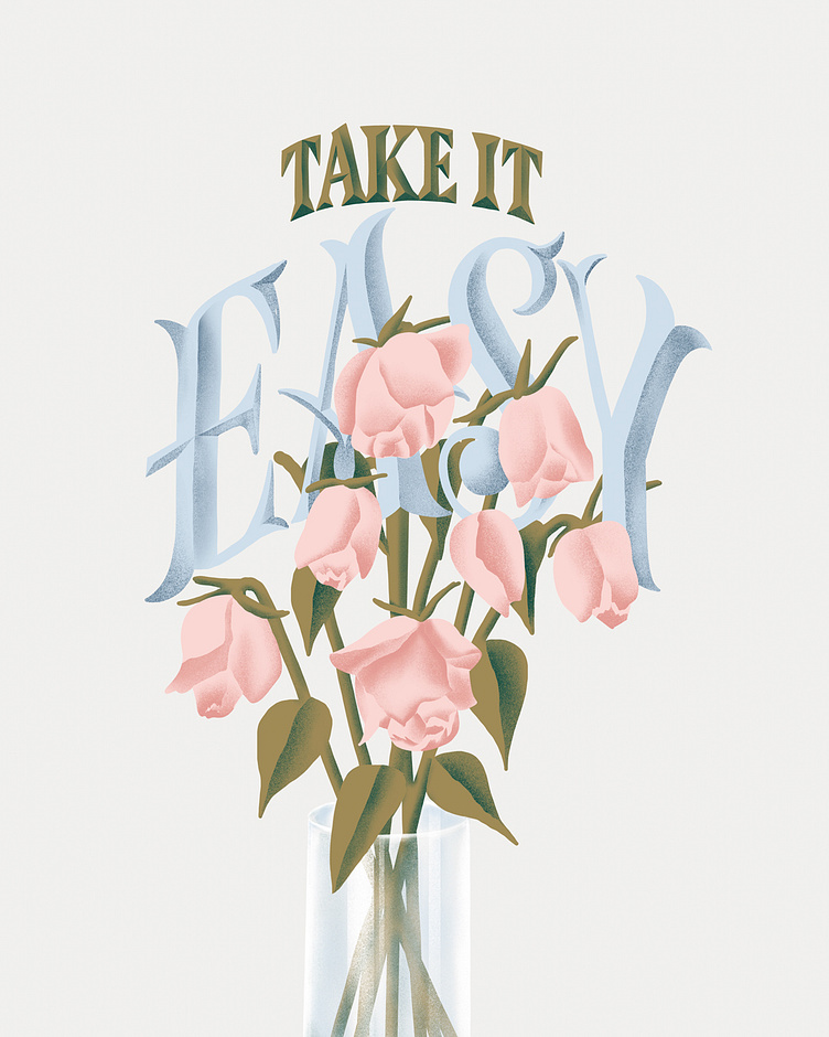
Take it Easy
I used letteringmaker.com to guide the lettering and art direction for this piece. It’s such a useful tool to get those creative juices flowing—thank you @martinaflor for creating and sharing this resource ❤️ — Style: Roman Width: Extra Condensed Weight: Bold Contrast: High Contrast Text: “Take it easy.” Application: Magazine Cover Attribute: Sad
More by Kiri Schwiet View profile
Like
