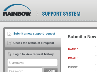
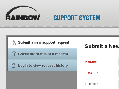
Support System, Final
Made the logo two-color, de-mucked the inactive tab state, changed the active tab state text to blue and turned the login tab into an actual login box.
Submitting a new support request and checking on the status of an existing one are two of the same kinds of actions, but login is a different kind. In the previous comp it was given the same visual treatment, and I felt that was confusing, so I moved it to a login form field that stays visible no matter the tab (we may be adding additional tabs).
More by Jesse Gardner View profile
Like

