Freend
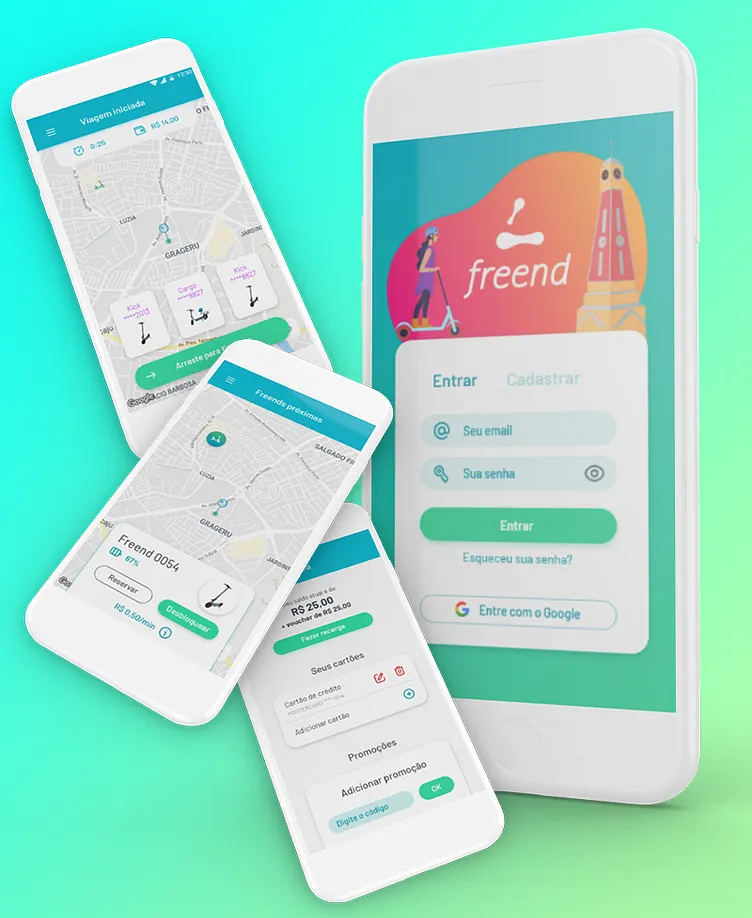
Freend app had been developed since 2019. Today, most of the app's functionalities has already been implemented , while others are being developed. I've been working on the UX/UI design process since the beginning, while the development teams have chaned twice already, which made the process of uniform construction of the app a little harder, but didn't prevent an improvement since the app's first version - in which I was able only to include the brand colors on the pre-made app that the business chose to use at the time.
The UI tries to follow the brand's communication and voice: a young person that needs to move throughout the city in a practical and fun way, and that's why the colors are very saturated. Still, I try to design the interface with a minimal of extra info, so there's no noise on the user's understanding and their interaction with the app can be the most fluid possible. There are, obviously, things that need improvement, and it's on the construction and with the users' feedbacks that the iteration can be done.
Also, you can test the app on http://onelink.to/qsheqv
