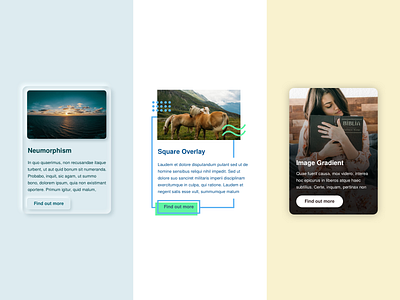
Card UI Examples Round 2: Neumorphism & More!
Hello all! The next round of card designs are here.
I've experimented here with Neumorphism, an illustrative overlay style, and the more commonly found gradient over image. I'm a huge fan of the gradient over image option (if executed correctly).
What over examples for card UI's do you like? Follow this page for more examples in the near future.
Checkout my Instagram to connect and see what I'm up to, day to day!
All the best -
Richard
More by Richard Jarvis View profile
Like
