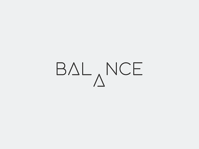
Logotype for "Balance"
Just got this new idea for "Balance".
Here's what it means:
The letter 'A' ( after letter 'L') is like a fulcrum and the other letters are balanced about that point ( 3 letters are on each side of the fulcrum and hence, it is balanced).
Hope you guys like it!!!
More by Moonlightproductions View profile
Like
