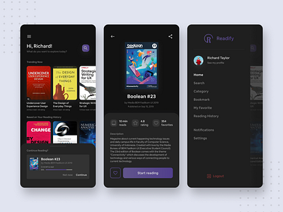
Dark Mode E-Book App — Exploration Design
Hello Dribbblers!🏀
This is my first try designing a dark mode user interface design and using this 19.5:9 ratio for the frame🤩
This exploration design is all about an E-Book reading application named "Readify" (just like Spotify or Shopify😋).
Anyway, in the book details page (2nd screen) shows a Boolean magazine, which is a magazine about current happening technology issues and daily campus life in Faculty of Computer Science, University of Indonesia. Created by my team and I when I was in Media Bureau of BEM Fasilkom UI 2019 (Executive Student Council). Kindly take a look further about it in https://bem.cs.ui.ac.id/boolean or read directly via issuu https://issuu.com/bemfasilkomui
Thank you! If you like it, leave a like and also follow me!😁
More by Revan Ragha Andhito View profile
Like
