Retouching & Vectorising a 70 Year Old logo
We completed this project a few years ago and thought we would share some of the processes behind what we did for Francis Chambers & Co Ltd.
They have been in business for over 70 years and was first established in 1947 by Mr Francis Chambers when Francis passed away in 1977 Neil Twynham became a partner (He first joined the company in 1960 as an apprentice armature winder) two years after becoming partner he later became managing director of the company.
His son, Gavin, joined the company in 1988 and just like his father worked his way up. Neil passed away in 2009 and Gavin became managing director of the company.
They are specialist Electrical Motor Engineers who are based in the heart of Rotherham, South Yorkshire. Francis Chambers is a well-established company with a trusted reputation in the industry and achieved certification to the internationally recognised standard ISO 9001:2015.
Gavid approached us to retouch and vectorise their logo that had been in use for just over 70 years and did not want to change it due to its age and heritage but bring it into the modern world which was totally understandable. We could have updated the design to something more modern but respected Gavins wishes and the companies heritage.
The logo needed to be vectorised to be used on a new sign for above the building, printed marketing collateral and the new website we would be later developing.
The original logo had been painted on the external building. The only version of the logo they had was from a newspaper cutting In the office on the wall there is an old newspaper cut out framed that also displays the icon celebrating 40 years in business so that newspaper must be from the late 80’s around 1987.
These images were of bad quality and not something we could have used to create a vectorised version.
We decided that we would take a picture of the painted logo from the external wall outside the building and use this to help us draw a neat version that we could vectorise.
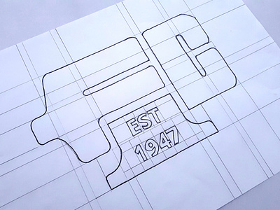
The first stage of this process was for us to draw their logo the good old fashioned way with pencil and paper.
We drew a grid on A4 sized paper so we could construct the letters and form their original icon.
Full case study available on our website:
