DIY Direct | Brand Identity

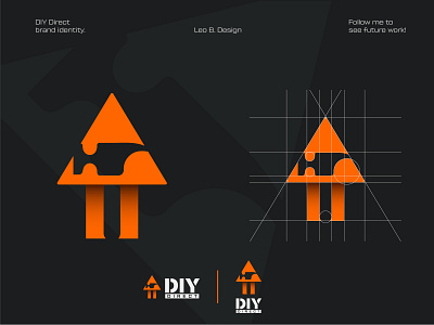
This is a logo made for a competition held by Tom Satori. The brief was to re-design his first logo.
I did this by combining a hammer, arrow, and house. This iconic mark, crossed with the bright orange, and contrasting grays result in very strong logo design and is shown throughout the brand.
To see the entire project head to my Behance project here: https://www.behance.net/gallery/94863067/DIY-Direct-Brand-Identity