Noggin Refresh

I really don't like the new Noggin logo.
One of the reasons why I don't like it is because of those DISGUSTING SQUARES IN THE LETTER 'N'. They should be rounded, or the 'G' should be square as well.
Nonetheless, here is my refresh
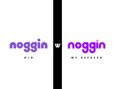
I really don't like the new Noggin logo.
One of the reasons why I don't like it is because of those DISGUSTING SQUARES IN THE LETTER 'N'. They should be rounded, or the 'G' should be square as well.
Nonetheless, here is my refresh