02. Card Checkout - Covid 19 Fundraiser
Daily UI - Day 2
#dailyui
I chose Covid-19 fundraiser because it was a unique way to complete this challenge. Hearing the phrase card checkout, we usually think about a shopping website's checkout page, and a fundraiser is rarely something people think of.
The design was straightforward and there weren't many components to put on the screen, so I figured that building this for a mobile device would be easy, and thus I chose a Desktop UI to make it more challenging.
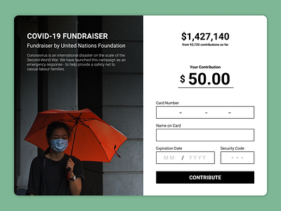
I knew I needed to add a picture to be able to use up some space and make the content more engaging. I chose this from Unsplash and set it to one side. This was a good framework for a two part contrasting design.
The nature of the topic demanded a bold design, as a result I chose the #000 black, used a bold sans serif font Roboto, and employed a sharp cornered design instead of rounded corners. For the background for this UI, I picked green as it was the complementary color of the red umbrella.
It took me about 90 minutes to build this user interface as I went back and forth with the layouts.
I am still unsure if I was able to best utilize the space in the top right, as there is no apparent division between the total contributions and the user's contribution.
