Bicycle Bike Rental Mobile App Exploration
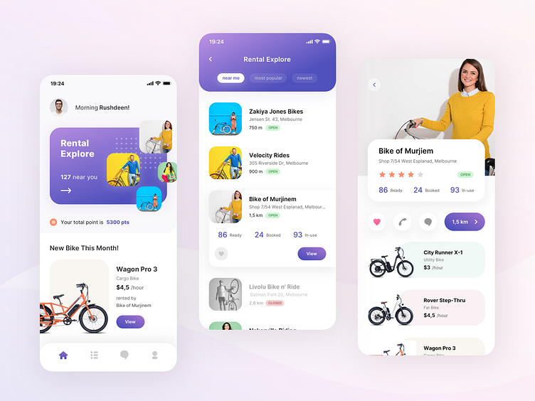
So this is my exploration of the Bicycle Bike Rental mobile application. There are three screens for this exploration to present my idea.
Here is the screens concept detail:
1 - Home
The first screen is after the user has logged in to the app. A user greeting based on the current time, Rental Explore card menu on the top with the number of rentals near the user, also the image thumbnail of active rentals pops on the home screen. Below that card, there's the current user's point earned. And the new bike promo to attract users to rent. So basically each section in this home screen is very dynamic. Data can be changed periodically.
2 - Rental Explore
Here is the list of rentals shown in cards that can be filtered based on the nearest location from the user, popularity, and newest rental. The concept is when the user taps one of the rental cars, it will expand to show the bike's availability and view the detail button. This concept aims to put a quick preview of rental status before users enter the rental detail screen.
3 - Rental Detail
Here we can see the list of bikes that the rental owns. To book a bike, the user can tap the bike card and go to the bike detail screen then proceed with the rent booking transaction. On the top area of the screen, there are images of the rental along with the name, address, rating, open/close status, and a number of bike availability. Below that information, there are buttons: love bookmark, call, chat, and direction with the distance to open the map and show the route to the rental location.
Alright, that's all :D, any thougt about this exploration? Feel free to leave feedback on comment :)
Press L if you like it.
Thank you.
---
Our Product | IG | FB | TW
---
We are Agensip, a creative digital agency focusing on UI and UX stuff. Kindly visit our website at www.agensip.com to see more detail about us. Never hesitate to contact us via email at agensipmail@gmail.com
