Sharks Redesign
Recently, I decided to revisit one of my first UI/UX designs, SHARKS.
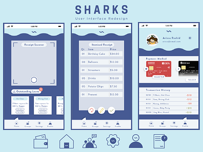
Firstly, I reflected on the home page and remembered how I modeled the initial homepage closely after Paylah's interface. It did not capture the key features of SHARKS nor did it look consistent -- the icons I designed did not look nor feel like they were from the same family. Thus, I narrowed down to 2 key features: the receipt scanner and the quick and easy payment option.
I also redesigned the icons to look consistent through standardising the colour scheme, fill and by incorporating a squiggly wave that reminds me of 3 things: an ocean wave, a letter S sideways (for Sharks), and a money sign.
Next, the previous breakdown of the receipt was unorganised and messy (I did not even include it in the previous post I did about SHARKS because it wasn't up to my standard). This time, I tried to organise the key information clearer and I'm a lot more satisfied with the outcome.
Finally, I added a Profile section for users to manage their payment method as well as to access their transaction history. I am especially happy with how the realistic look of the cards fit in well.
Overall, I tried to simplify the process of SHARKS as my previous version involved too many steps. I also tried to clean up the look of the interface, to capture the key messages and features.
