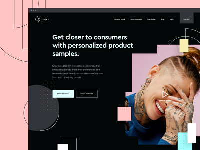
Odore Website Dark Mode
Hi guys,
I just had to give it a go - here's a snippet from a dark version of Odore's homepage. This one didn't make the cut, but was a fun exploration. Eventually, the client liked the light version better (and so did we) so we went with it.
Late last year Odore reached out to us to help them reimagine their online appearance, while at the same time they were busy changing their product physically.
Odore provides an intelligent research and marketing tool by creating rich interactive experiences that entice shoppers to share their preferences and receive hyper-tailored product recommendations from today’s leading brands.
UX Design - Bo
Creative Direction - Dale
UI Design - Karlo
Supporting Graphics - Johnny
♥ Happy to hear your thoughts
--
Need help with your project? Let's partner up!
