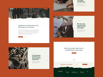
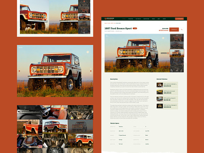
Backroad Classics – Consignment
**Update**
For their consignment page, Backroad wanted to display the content in smaller chunks for ease in retention.
My idea was to snap the user into each section, so they could spend time carefully reading the content. As the user clicks the arrow (or scrolls the page) the text and image would swap out to either the next or previous section's content.
On mobile, since section snapping could get frustrating, I combined the three steps into one section. By doing so, the user could now freely explore the page.
7.6.BR-consignment (M).png
700 KB
More by Jeremy Nolan-Cherry View profile
Like


