Daily UI :: 003 (Landing page)

This is the 3rd part of daily UI Challenge. The landing page for the company(TWF Flours) that I currently work in. This is more like a case study than just a challenge. So here goes the brief, challenges, problems and my UX/UI solutions.
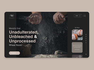
As I surfed the current website of TWF flours I found that there were a lot of UI and UX improvements needed. The 1st image is my redesign and the 2nd image is the current website of TWF flours.
Problem 1: The visual hierarchy was the very first thing that I thought needs to be changed. The very first thing that a user wants to see when he lands on the website of any company is to get the idea about what that company deals in. Here as we look into the current website, we do not get a clear view as to what the company really does.
Solution: I Removed the unnecessary text and white space from the website and used some high quality images and limited amount of text to convey the idea as to what TWF flours is all about. Now you see how your eyes immediately moved towards the bold text on the left ?. Yup that's exactly what twf flours does, they manufacture Unadulterated, Unbleached and Unprocessed wheat flours.
Problem 2: The CTA button on the landing page was very big and had too much text in it and was very vague as well. CTA button should be small, distinctive, simple and should look clickable.
Solution: Just as the user finished viewing the left text about the company, I tried to keep them in the flow so that they want to know more about the company and thus I gave a CTA of 'Explore'.
Minor Tweak 1: Typographic adjustments. I saw that some of the text was right aligned, some was in centre, also the line spacing was not right between sentences. I left aligned everything and made the line and letter spacing uniform throughout and now it looks much easily readable and pleasing to eyes.
Minor Tweak 2: Another thing that I noticed was that the TWF flours used a black theme throughout their products. Their products packaging were black, the gift cards they sold were in black theme, the brochures and pamphlets that they inserted inserted inside the product packaging were black in color. So I thought why not make it consistent throughout, let's convert the website also in dark theme. And here it is. Another advantage of using a dark theme is that the things are much easier to read and analyse. And thus considering the target audience of TWF flours, I thought black would be much suitable and would make more sense.
