Nudge
1 Hour Logo Challenge #5 Nudge
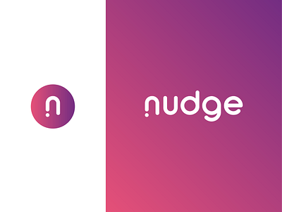
Think of Nudge as a business communication platform like Slack, built to make working life easier. In its simplest meaning, nudge is a light touch. Knowing that at that moment, I interpreted it as the simplicity of the app itself where a touch would be all it was gonna take to set off conversations. Feeling the need to translate that into a form as the logo, I brought a dot into play to symbolise it all.
The concept and the simplicity of the design were equally liked by Hitesh himself as he saw lots of possibilities to where this logo could go. He set an example by saying that he could totally imagine a nice logo animation for the splash screen of the app.
The design may not be the most polished at this point of time, but I hope you like this work of mine as much as I enjoyed designing it! 👩💻

