01. Registration and Login screen - Amazon redesign

Daily UI - Day 1
#dailyui
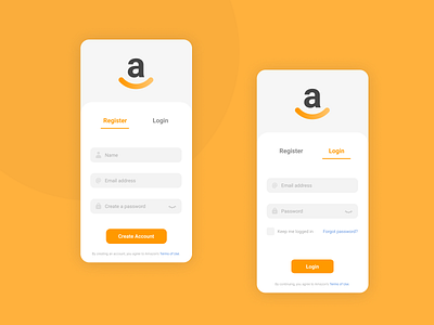
I chose Amazon signup because of its outreach and familiarity among people.
One challenge I faced was my submit action buttons and the selected tab indicator looked the same. So, I changed the tab indicator to using an underline instead of a background solid color.
I spent a lot of time in this challenge and 80% of the design took around 45 minutes, while I spent 60 more minutes on the remainder 20% pushing pixels to perfection.
What I learned was that a designer should be able to know when they have completed a round of good enough and limit oneself to reach for that perfection, especially when running tight on time and resources.