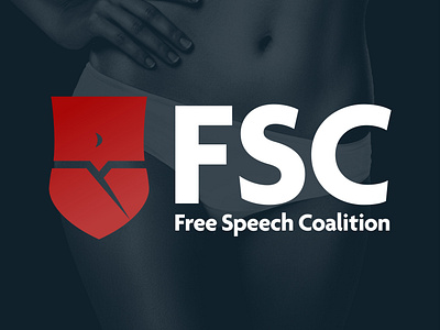
Free Speech Coalition Logo
When I started working with Michelle LeBlanc, Executive Director of FSC (a trade association that protects the rights and freedoms of the adult industry), I couldn't have predicted that the values inspiring and built into the logo would become so immediately pertinent. With the current state of things during the coronavirus pandemic, the significance of this new logo really shines.
We started collaborating on a branding refresh back in February. "The Before Times" as I think we're calling it now. While talking over the creative, Michelle expressed that a key priority of this logo was a focus on bodily autonomy as speech was already implicit in the name. If we could combine both, bonus points.
My mission became to find a way to symbolically represent the ideals of owning your own body and I found myself drawn to the idea of crossed legs. There's a power there. Crossed thighs express that you are the one in control of your body while also alluding to the adult industry for which FSC advocates. Working the stomach into a speech bubble was when the logo finally clicked into place. Because that formed a third shape - a shield.
And that shield brings us back to our current situation. FSC has started rolling out their new branding early, as the shield logo serves as a reminder that FSC is out to protect workers in the adult industry, workers who are largely out of work while self-isolating.They're currently raising money for their emergency fund which rolls out much-needed funds to those in the adult industry who need it most right now.

