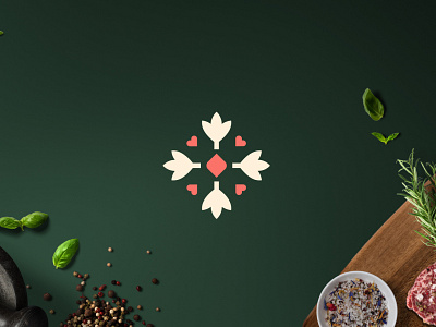
Restaurant symbol
The main attributes of the brand, passed on at the briefing, are: Delicate, Sensitive and Reliable. In this way, we sought to use typography in lower case, sans serif and bold style, giving a friendly and youthful touch. Dark green aims to bring confidence, which at the same time balances with the delicacy of the shades of pink and cream and also with the elements used in the symbol, with rounded shapes.
To see more from this project go to: https://www.behance.net/gallery/94620347/Cozinha-Afeto
Are you looking for a logo (re)design for your business?
I'd be happy to hear your story! Feel free to reach out!
tbdesigncriativo@gmail.com | www.instagram.com/thaborba.design
More by Tharinne Borba View profile
Like
