Ticket Info Page for Event Website
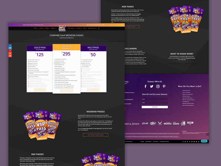
Screenshot of the redesign of the Ticket Info Page on the FanX website. Designed for their exclusive Premium Divi Child Theme using provided resources.
UX Design Problem Solved: The redesign solves user experience issues with the previous ticket info page, which acted as a 'dummy' shop page that linked to the actual offsite shop. The layout created the possibility for confusion and distrust, as the customer saw what appeared to be two separate shops, the latter of which was not a part of the original website. It could also create a feeling that the customer has to do double the 'work', having to find and choose which product they would like a second time. Both possibilities increased the likelihood of cart abandonment.
The Ticket Info Page redesign acts as the "research stage" in the customer journey, using the page to introduce the products, and encourage the customer to begin the purchasing process (instead of making them think they've already begun it.)
It also separates the products into different "ticket types" reducing the possibility of overwhelming the customer with too many choices.
