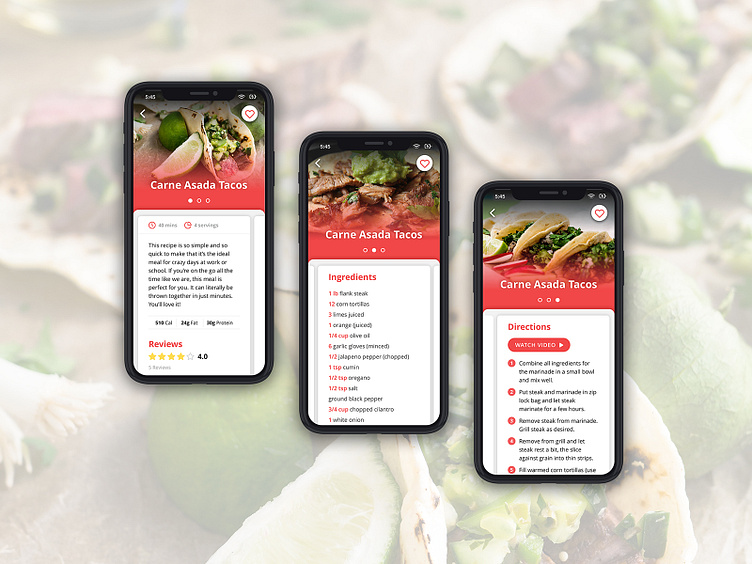
Recipe App Screens
I designed a few screens for my ideal recipe app just for fun. I always hate skimming through long paragraphs of intro text just to get to the ingredients and instructions. I also hate scrolling back up to find the ingredients and their quantities once I start cooking, so this app solves those two issues by placing each category on its own card that a user can easily swipe right and left to view.
More by Ashley Niro View profile
Like
