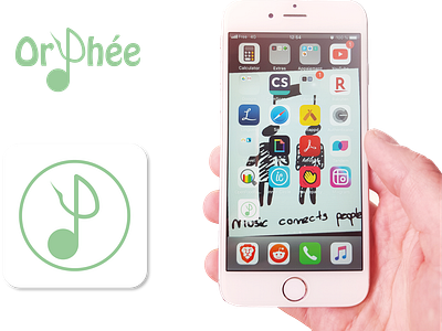
App Icon - Orphée
The logo I designed is from a high fidelity mock up I made for a music application I imagined.
How I have created it
I imagined that the letter "P" could be transformed in a musical note without changing the understanding of the word. So I kind of designed a "musical P letter".
Font type
I wanted something fun (but not too much) in order to transmit the ease of use of the app. The font I used is : "Hobo Std Medium"
Why Orphée?
As some of you might realised, Orphée is coming from the greek mythology. He is known as being a poet and a musician, that is why I found it relevant to use this name.
More by Steve Piraud View profile
Like
