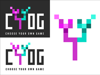
Pixel Gaming Logo Design
The client wanted a logo that incorporated an old gaming feel that is pixelated and demonstrates that the website is for gaming tournaments, so the "Y" is like a bracket with 2 teams coming together with the 2 company colors.
More by Natalie Isaacson View profile
Like
