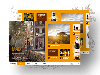
Kofola.cz pitch / homepage & grid
Pitch designs for a website of the no.1 soft drink in the Czech Republic. The designs were done by Filip Slováček, I was responsible for the wireframing, animation and creative direction. The illustrations by Dana Ledl. The project was a collaboration with Ogilvy & Mather / Advertures.
The idea behind the website was not only to present info about the products and the company but also to function as a hub of all brand’s content with focus on social media. We introduced a horizontal grid which allowed us to accommodate the different types of content in a chronological manner, and in the desired content-type mix.
Horizontal grid, oh boy. Do you think it’s making a comeback?)
More by Luboš Buračinský View profile
Like


