BRIGHTER DAYS CO. LOGO DESIGN
Logo concept for Brighter Days Co. It is a female run home fragrance business, that specialises in hand poured products made in small batches without harmful chemicals. Their main focus is their wooden wick soy candle, but they also make reed diffusers, essential oils, room sprays, etc. Their product packaging is fun (with their witty sayings), yet simple to match everyone's home decor. Their target audience are females between the ages of 25 and 40.
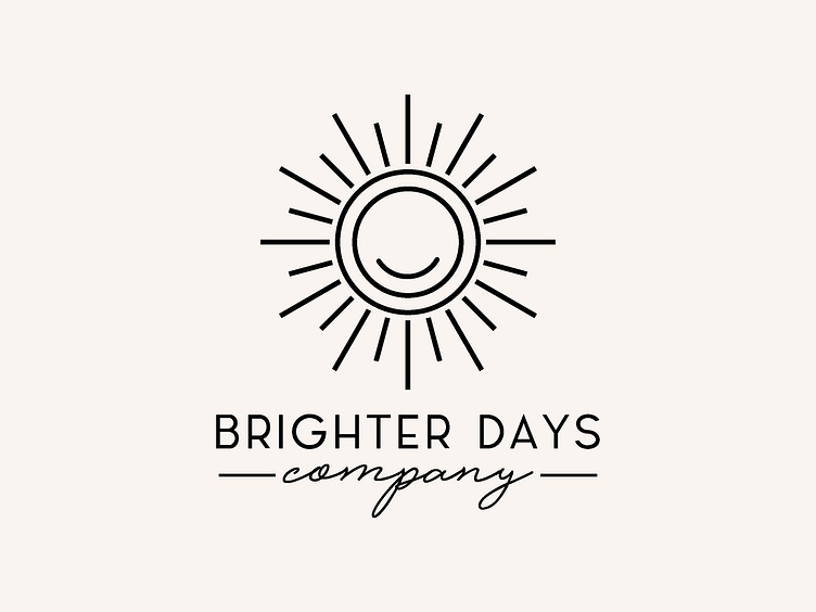
One thing she wanted was a sun.
So the logo is a sun, but the rays represent wooden wicks of the candle, I previously gave her an option where the wooden wick looked more like a wooden wick but she wanted something very simplified, hence I converted it to single lines of different sizes to represent wooden wicks of different sizes, that is why if you notice the rays have flat ends and not pointed or rounded. Added a smiley to represent their mission of bringing smile ti their customer’s faces through their witty sayings.
Let me know what you guys think of the design and concept.
Lets connect on www.instagram.com/navera_s_aftab
