cheeri Logo

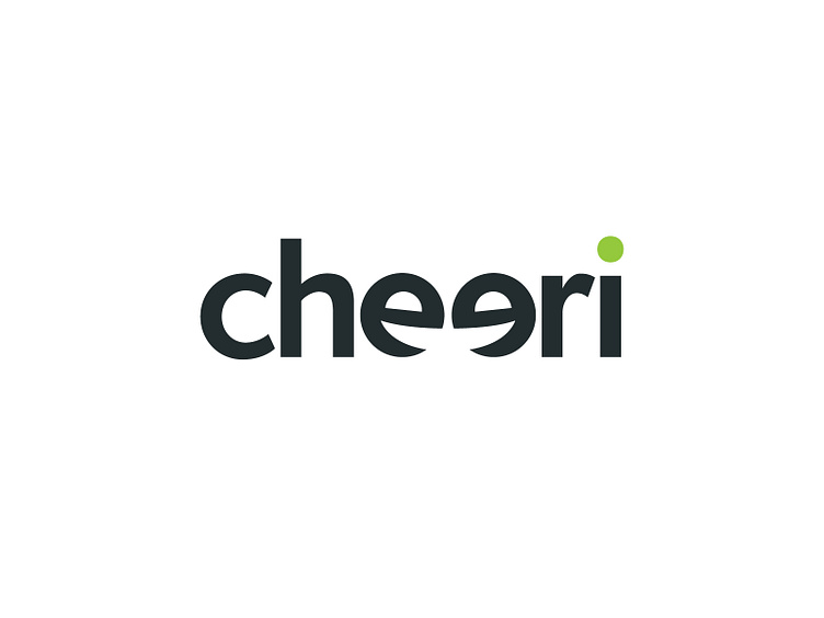


The cheeri logo is first and foremost "cheerful"; it focuses on a positive sentiments that emphasize the human-focused values of the brand. The logo is timeless, unique and present.
The logo symbol is a combination of typography and symbolism that is embedded in the typeface. The symbol is made of the two e letters at the center of the brand name, facing each other, and manipulated slightly to look like two smiling faces, conveying cheerfulness and human interaction. The e's were rotated slightly and the "smile" created by the lower curve was accentuated to verify they are clearly read as smiling faces but without hindering the legibility of the brand name. The "eyse" of the e's were very slighly rotated and resized in order to deemphasize a "grin" (vs. a "smile") and to further humanize the characters.
