Another Concept For FUTURE FOOD FRANKFURT
Another concept for my recent project for FUTURE FOOD FRANKFURT.
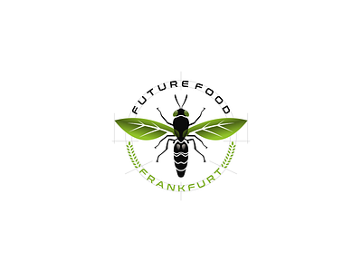
I made a new font variation. And also I made it in a balanced and precise way, as you can see in the logo construction. Of the two words between "FUTURE FOOD" and "FRANKFURT" have the same font size as well as the distance between the two. This font feels more industrial but is also eco-friendly at the same time due to the blunt ends of the font. It also feels more agriculture by displaying agriculture icons (wheat) more clearly.
_ _ _
Want to work with me?
For project inquiry email here:
tisahagustina18@gmail.com
