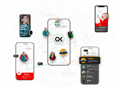
SaftyFamilly – application
UX part: over a series of workshops, come up with a strategy and visual direction I've stared to simplify the userflow in application. Adding devices/phone/people, payment process and registration were identified as a frustrating points for users.
Reducing number of steps from 12/15 to 4/5 for each part and starting in–app communcation solved the main pain points. I designed almost 120 screens and tested them with real users.
UI part: The design direction for the new applications were agreed with entire team.
Giving freedom to the developers, encouraging all the people involved to express their opinions on the project meant that ideas were flowing freely, allowing many of my ideas, suggestions and changes to be incorporated into the final version of the app.
The new "Safe Family" app was born.
