Daily UI 005 – App Icon
For day 005 of the Daily UI Challenge, I reimagined Amazon's app icon. Their current app icon places emphasis on a shopping cart and uses their full logo. (Check out what it looks like here on the App Store for comparison.)
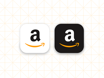
I decided to simplify their app icon by focusing on their "a" mark and using their instantly recognizable brand colors. I also created a light and a dark icon.
What do you think? Light or dark? Old or new?
