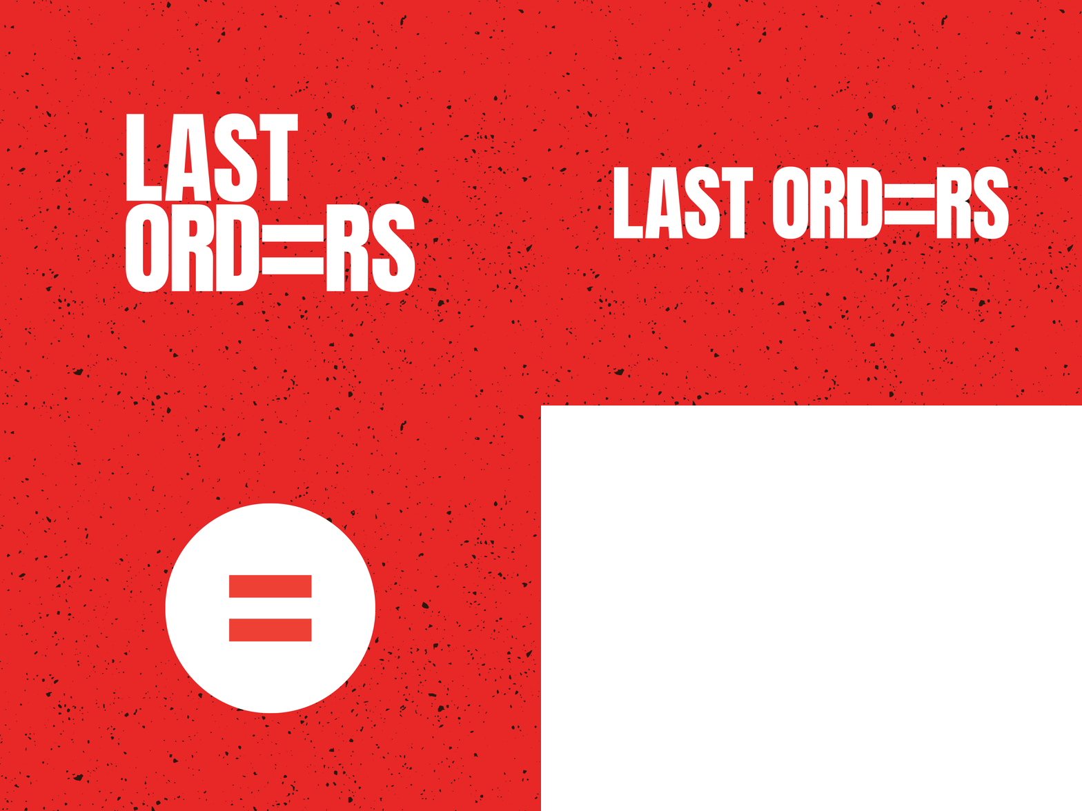
LAST ORD=RS - Logo / Logotype Design
LAST ORD=RS is a (Fictional) Non-Profit organisation that aims to combat sexism by challenging the language and the sexist attitudes towards women in the workplace.
Using ‘ANTON’ - a sans serif font - was perfect for the tone of voice the organisation wants to emit to its target audience, with the font being loud, impulsive and intrusive in order to capture their attention, just like how certain types of people are intrusive to women in pubs while working.
The ‘=’ sign is used frequently and represents that men and women are equal, with the underlying message to fight inequality that still exists.
More by Lewis Webster View profile
Like
