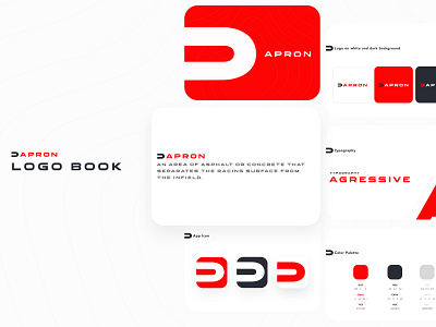
Apron Logo Design
Hi Folks 🖐
📗What is Apron?
The apron is a platform where those who love motorsports can follow the current news and follow the races live.
🙌What have I done?
I designed visual languages and brand awareness with a new logo brand, color scheme, application, website, and mobile application.
🧠Where Did I Get Inspired?
The apron is an asphalt or concrete area that separates the racing surface from the field. I set the red color, which we often see in motorsports, as the primary brand color.
I will also share their designs from the web and mobile applications soon. I hope you like it
More by Erhan KBekar View profile
Like
