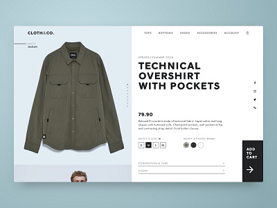
Daily UI 012 - Single Product E-commerce Page
For this e-commerce product page, I decided to go with a men's clothing website. I used monochromatic tones and bold, blocky text for a more masculine feel that is still modern and approachable. A full-height vertical carousel allows product images to shine, while an unconventional "Add To Cart" button provides added personality and encourages users to convert. Product images from Zara.
More by Shirley Zhou View profile
Like
