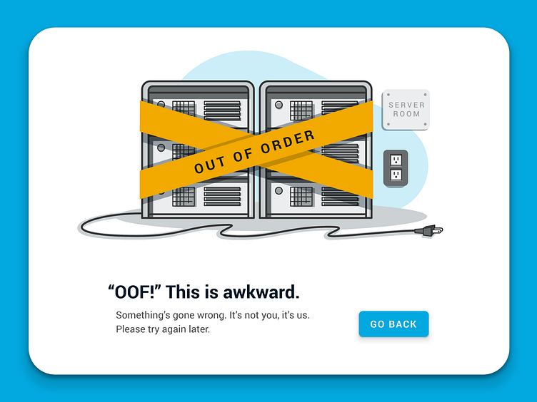
Error Page Spot Illustration
When a user is confronted with a frustrating experience we can use design to soften the blow. Take, for example, the simple 404 error page. By using spot illustrations we can turn this otherwise disappointing experience into something the user is almost glad they stumbled across.
More by ZoCo Design View profile
Like
