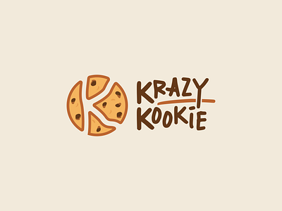
Krazy Kookie
1 Hour Logo Challenge #4 Krazy Kookie
Given a made-up name for a cookie brand to work on this time, I went along with the obvious and aimed for a fun look with a handwritten typeface and playful type arrangement. Had to make use of the letter "K" as that’s two of the name initials, and embedded that in the exact form of their product 🍪
Hitesh made a remark, saying that the typeface itself might already look good as a logo, but liked the overall design nevertheless. It felt crazy indeed for him, though the icon can be simplified further – perhaps do without the outlines and remove some of its small details. It might be interesting to try out another idea too: something like this, so it’d be a Kr and Ko sharing the same K for the icon.
Well, it has been nice and fun with this cookie over here for me. Hope you like it as much as I enjoyed designing it! 🤗

