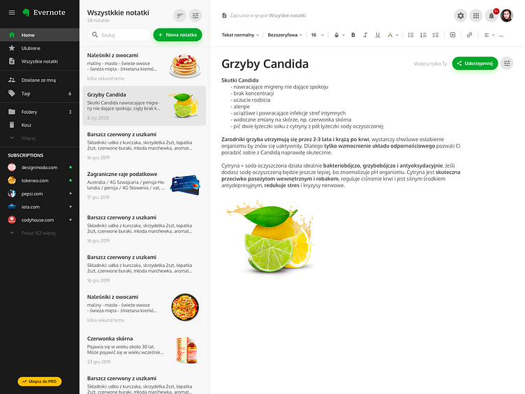
Evernote New Look
1) Case Study Overview
SUMMARY: As we are talking about a summary of the project, my goal was to improve existing Evernote.com ROLE: My role was do research and deliver a pack of useful usability features. Especially IDI research, user flows, information architecture, sketching, wireframing, branding UI, prototyping. I provided my complex UX and UI services. What responsibilities did I have? The answer is: every kind of responsibility. It was my own project in total. CUSTOMERS: Evernote users TIMELINE: 1 day
2) Define the Problem and Project goals (Telling the story)
The problem was to identify and fix minor usability issues. Key issues: - Find better space for CTA „New note” - gain 10,000 happy users - increase user retention by 10% - improve MoM revenue by 30% - decrease haters feedback by 50% - advance over NPS scores in the next six months
3) Scope of work
Stating the project’s scope helps in comprehending the case study further. The project was great opportunity to show my project management skills. I handled staying on budget, staying on time, and scope creep for this project.
DISCOVERY & STRATEGY SERVICES - Baseline Evaluation - Research - Branding Strategy - Experience Strategy - Production Planning BRANDING SERVICES - Branding Strategy - Visual Identity and Assets - Collateral - Brand Guidelines - Design System COMMUNICATIONS SERVICES - Communications Style Guides - Messaging, Voice, and Tone - Internal Company Materials - Content Strategy and Production INTERFACE DESIGN SERVICES - Information Architecture - User Flow Mapping - Content Strategy - Wireframing and Prototyping - UI Kits and Pattern Libraries - Visual Design - Responsive Design DEVELOPMENT SOLUTIONS SERVICES - Front-End Development - CSS Development
4) Target audience
Every single one Evernote user. So they are people in age range 20 - 60 yers old. Problem affect them because they can’t create a quick note. Maybe UI was not clear enough. Maybe layout wasnt good.
5) Design process
Design process involved a lot of components: * User research * User journey mapping * Wireframes * Mockups * Prototypes * User testing * UX writing * UI design * Accessibility testing * QA testing
My design process:
STEP 1: Define - Scope - Problem - Users STEP 2: Research & Synthesize - Consumer Insights - Competitive Analysis - User Journey STEP 3: Ideate & Evaluate - User Flow - Need-to-feature Map - Sketching - Design Critiques STEP 4: Design - Wireframes - High-fidelity Prototypes - Design System
6) Deliverables and the outcome
I hit my desired goal and now I will measure success for the project in depth. Basically, this is my final design and the positive effect it had on the business.
7) Lessons learned
This project taught me agile management and work under preassure. Everything went according to plan. I handled it. I learned a new work method and get a lot of practice. Now I am a better at my profession because of this project.
What insights have you gathered along the way? Tell me, please. What would you change? Maybe you figured out a better way to conduct this case?
