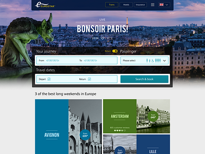
Eurostar 'booking magnet' component concept.
I was tasked with re-imagining the 'booking magnet' component.
I began with a critical analysis of the existing booking component, overall affordance, UI/UX, visual language, content logic and page narrative.
In the screens you see here, I show how longer input fields look and function, pre and post completion. What do you folks think?
More by Nenad Kojić View profile
Like

