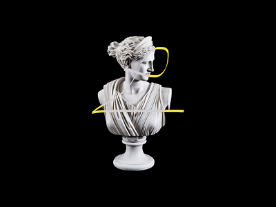
Sketchnoting – branding
Inspired by classic beauty and by duality. I would like to marriage the functionality and a refined aesthetic that produce the brainchild of loud minimalism. Defining elements are: grid system, asymmetrical layouts, sans serif type, photography, precision and geometric abstraction but ... mixed with some soft form, rounded edges and "wink" to the spectator.
More by Jakub Szufnarowski View profile
Like
