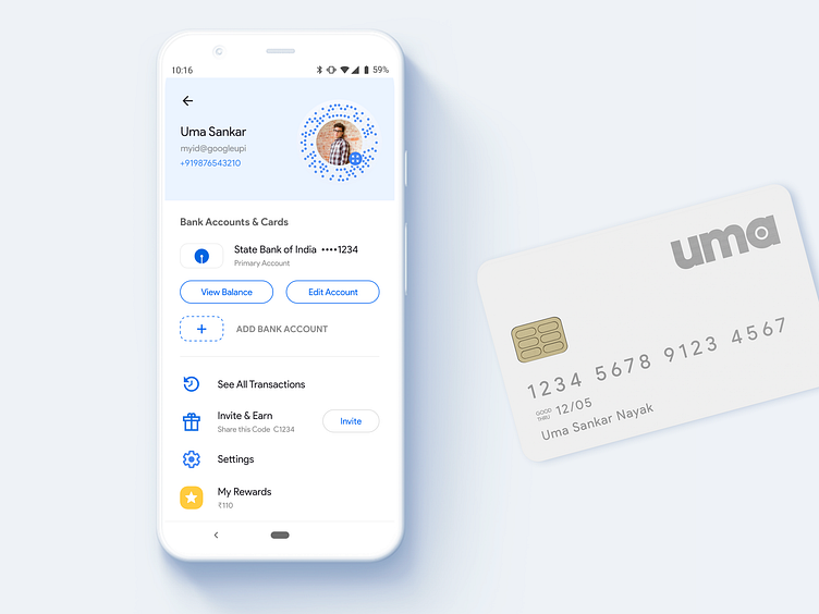
Google Pay Redesign - My Account Screen
A more usable Google Pay is a fun project as a part of my UX case study. Read here 👇 https://medium.com/@umasnayak/is-google-pay-tez-a-well-designed-app-ux-case-study-12419e3768da
This concept has been created to practice my skills with no client restrictions. The main goal was to design an interface that could reduce difficulties faced by me (might be many others) while using this app. This is not an official project, although I would love to send these as a part of my feedback to the Google Pay Design Team.
More by Uma Sankar View profile
Like
