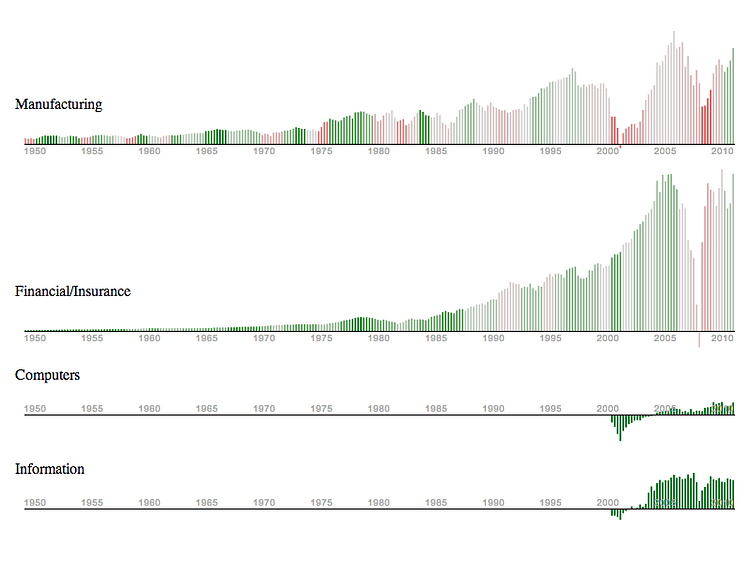
Employment and Profits Chart
I was playing with some economic data recently using d3.js. For the chart above, the height of the bars represents the industry-sector's revenues, while the color represents its increase/decrease in employment. Interesting data, but the sector segmentation wasn't as fine-grained as I'd have liked.
Lesson is, Information Technology and Computers are good industries to be in from an employment perspective!
More by Alex Sciuto View profile
Like
