Oral-B App Concept
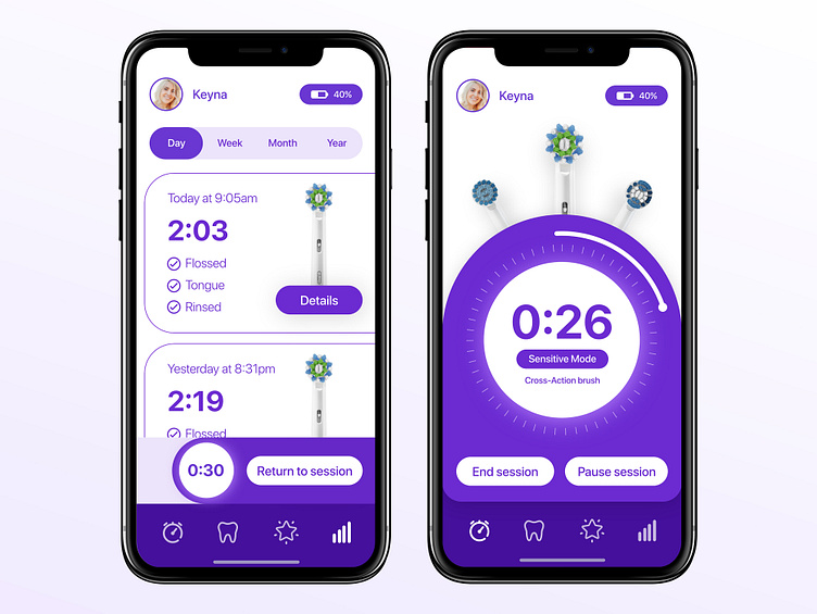
The Oral-B app has it’s fair share of bugs but while I am patiently waiting for fixes, I also thought the user interface leaves a lot to be desired. I believe apps should be functional but fun to use. Some of the higher-end bush handles offered by Oral-B has the ability to change the colour of the Smart Ring. The purple colour of this design came from the idea that the entire app should adapt to the colour the user chooses in the smart ring settings.
I placed the timer on its own section in the bottom navigation, moved the settings to an account picture at the top, added the ability to see the battery percentage of the toothbrush and also allow the user to see what brush head they have chosen.
While some of these will require updates to the hardware, I think the overall concept is more intuitive than what the current app offers.
