VINES & PINTS (TM)


VINES & PINTS (TM)
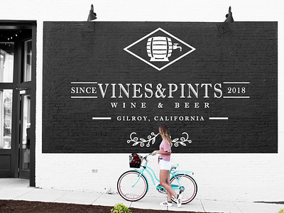
Creating a logo for Vines & Pints (a beer and wine bar) to use in all applications including social media and print marketing pieces as well as ideas for signs.
The idea was to keep the logo simple. We were considering other color options, however the challenge with the font and the style that we have chosen for Vines & Pints can easily perceived as dated with an addition of colors, the intention was to keep it modern and simple. To make sure V&P doesn’t fall into that category I suggested a very high contract color palette of black and white, in all cases. With the added element of the brick wall that is found inside the bar, this will add warmth and a feeling of coziness keeping the beauty and the history while also keeping it simple.
Regardless, the look will be classic and never go out of style or trend. It’s hip without meaning to be
I created some icons, and markers to be used throughout the space and marketing of the bar. The idea is to help keep the company on brand and add a secondary level to the vibe of the bar. Just some ideas for icons and pieces that can be used for signs and posters for the bar.
